Colour is Key at the Sydney Knowledge Hub
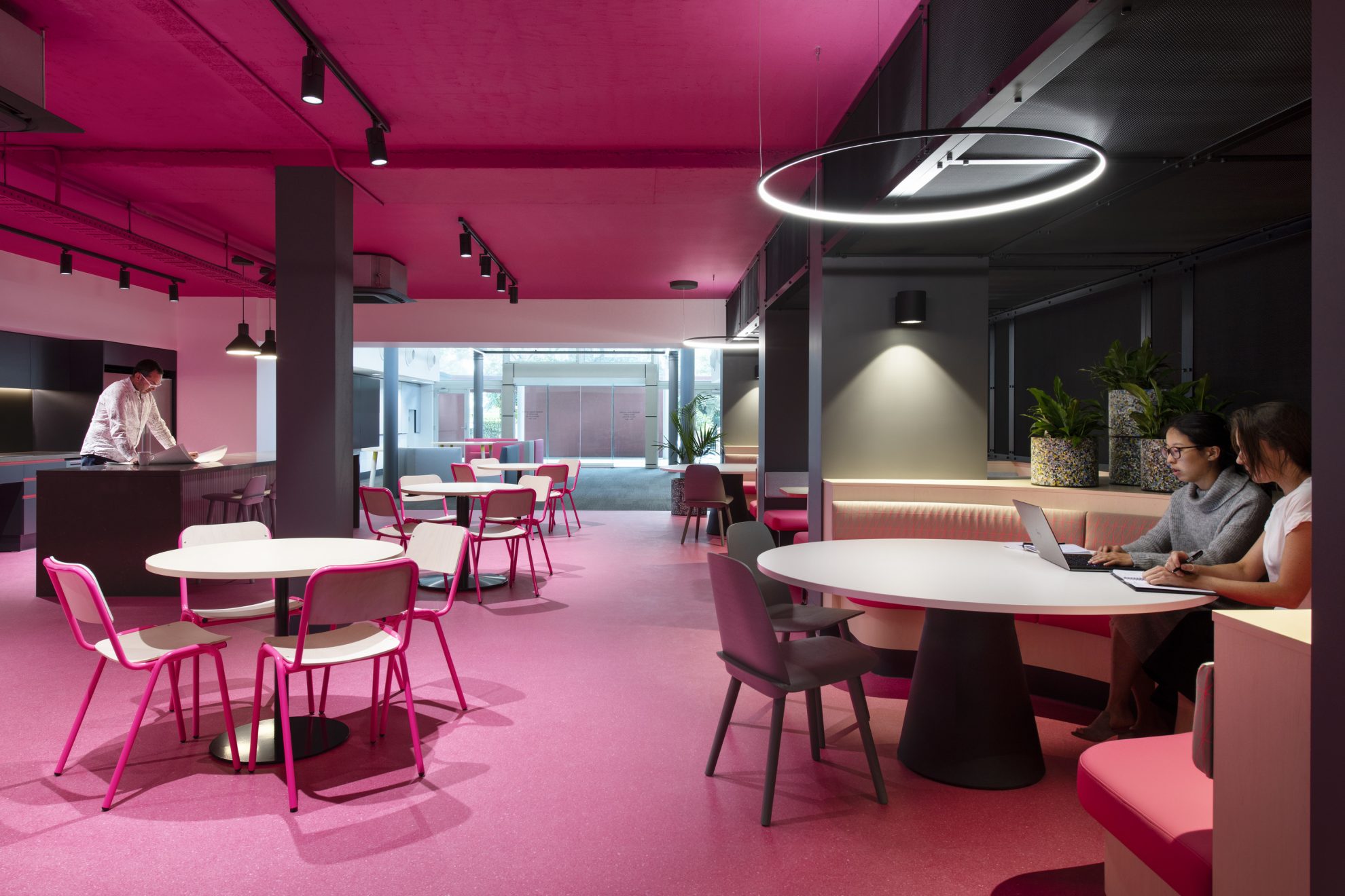
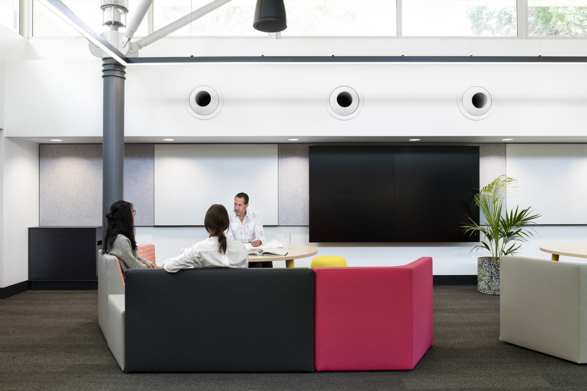
Hot pinks, bright blues and sunny yellows – the Sydney Knowledge Hub within the Merewether building at the University of Sydney is a co-share space that uses bold colours to connect its work zones.
An existing structure, it was decided that instead of knocking the building down and starting again, smart interiors could inject new life into Merewether. Interiors were reconfigured to deliver an original and innovative connection to the campus and create a new strategic direction for the space – prioritising engagement between industry, the existing campus and student experience.
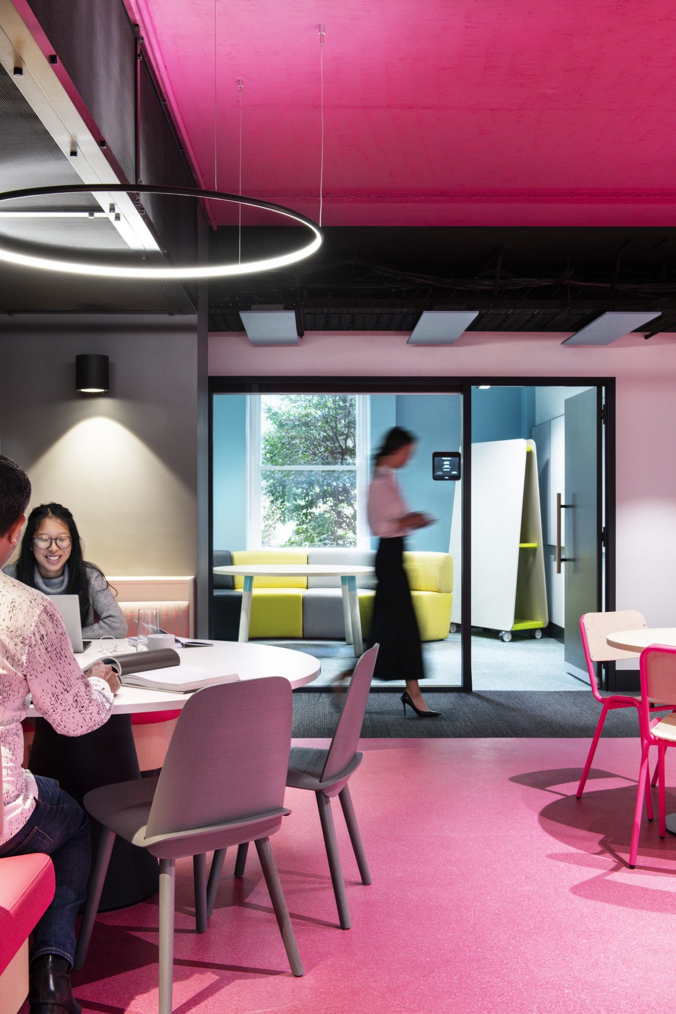
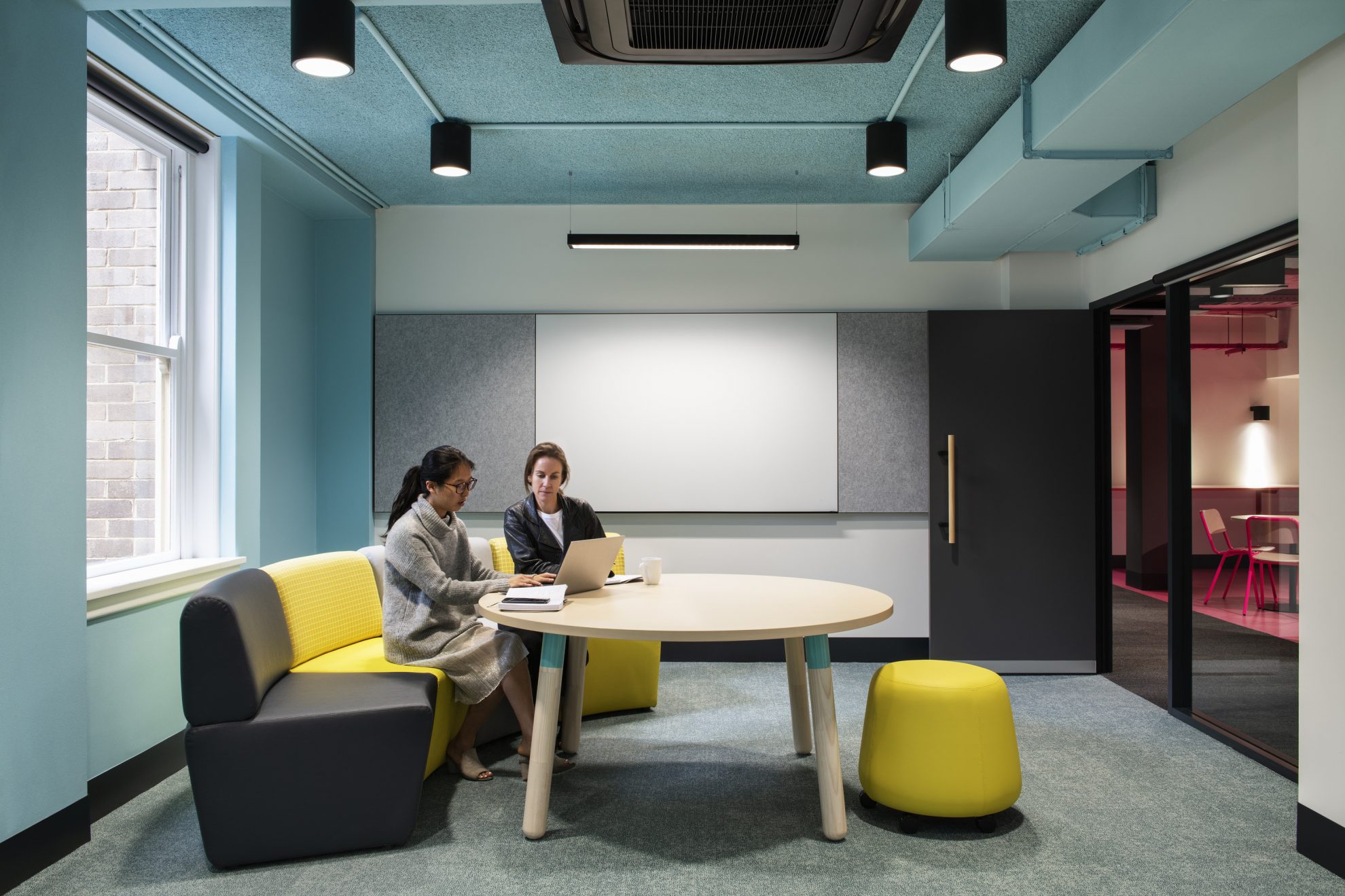
The Merewether building (built in 1964), was originally a series of university support offices off long central corridors. The building is disorientating with four long zones that connect around the central courtyard all feeling similar. Once opened up, the interior spaces were long and narrow, with a promenade of columns lending naturally to a central circulation space.
Colour and materiality were key to the design of this fit-out creating passive wayfinding in a building that was difficult to navigate.
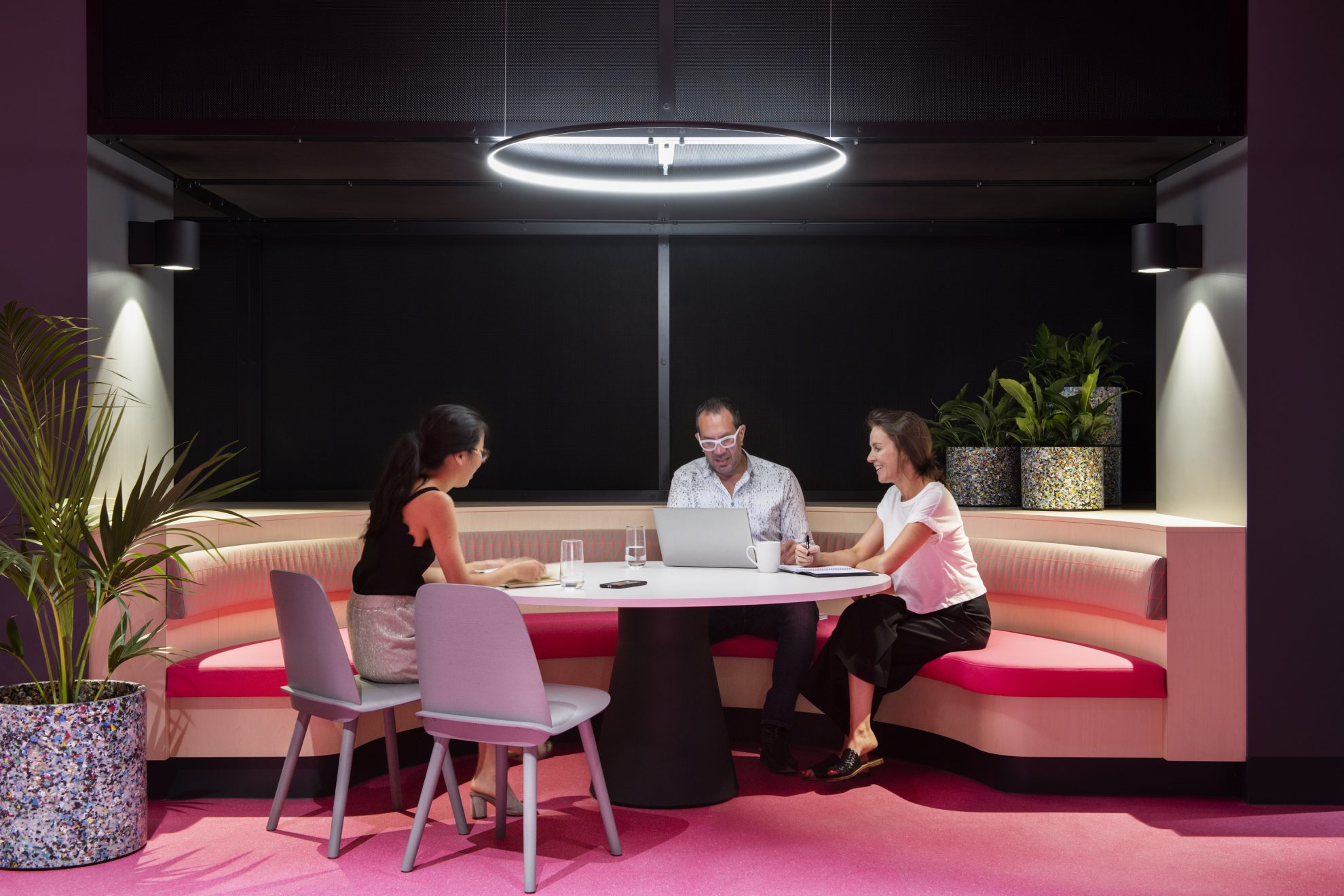
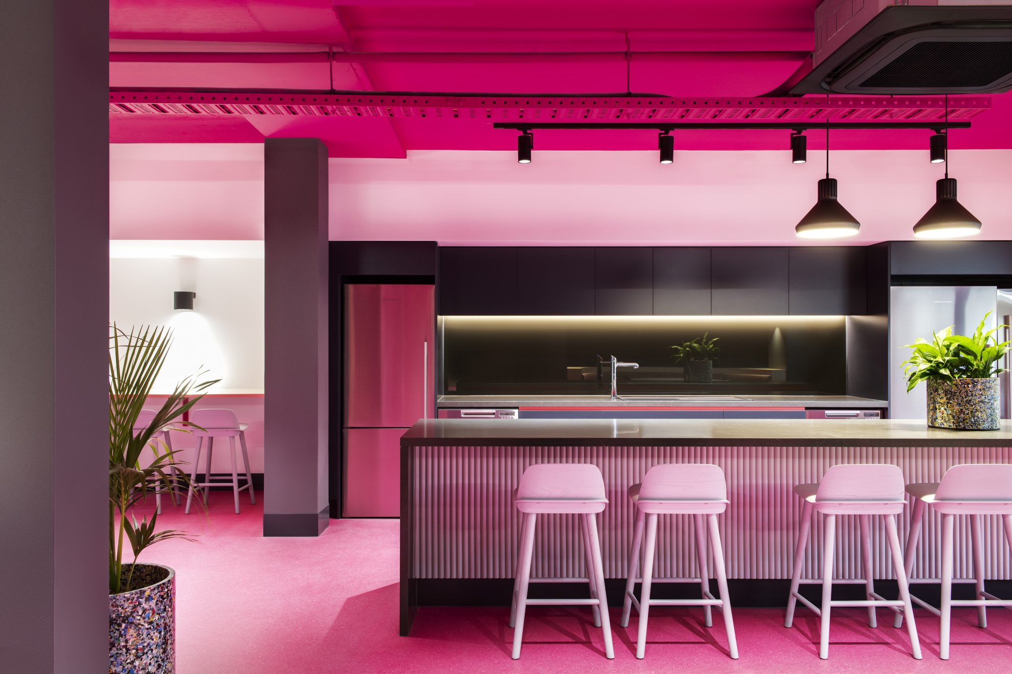
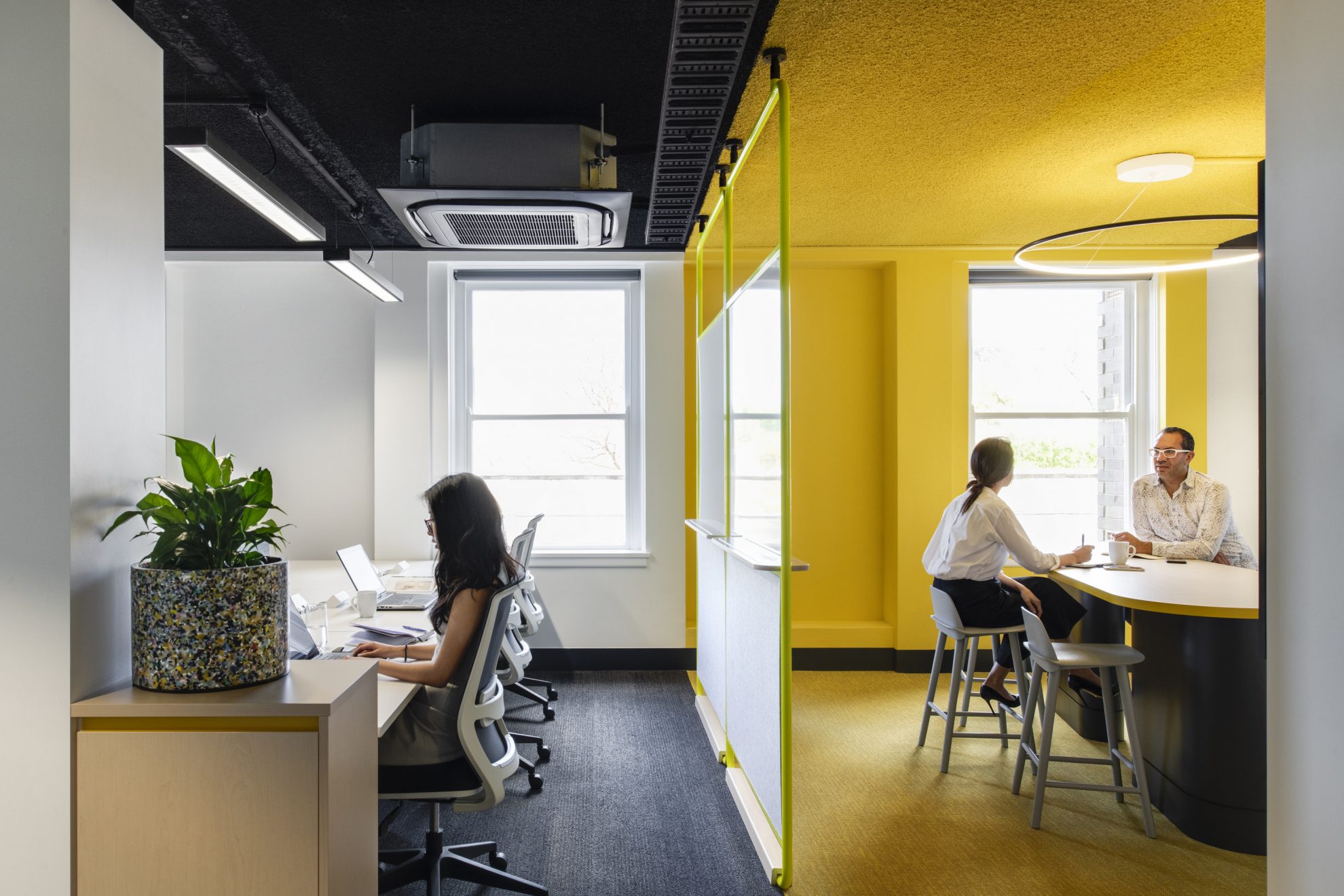
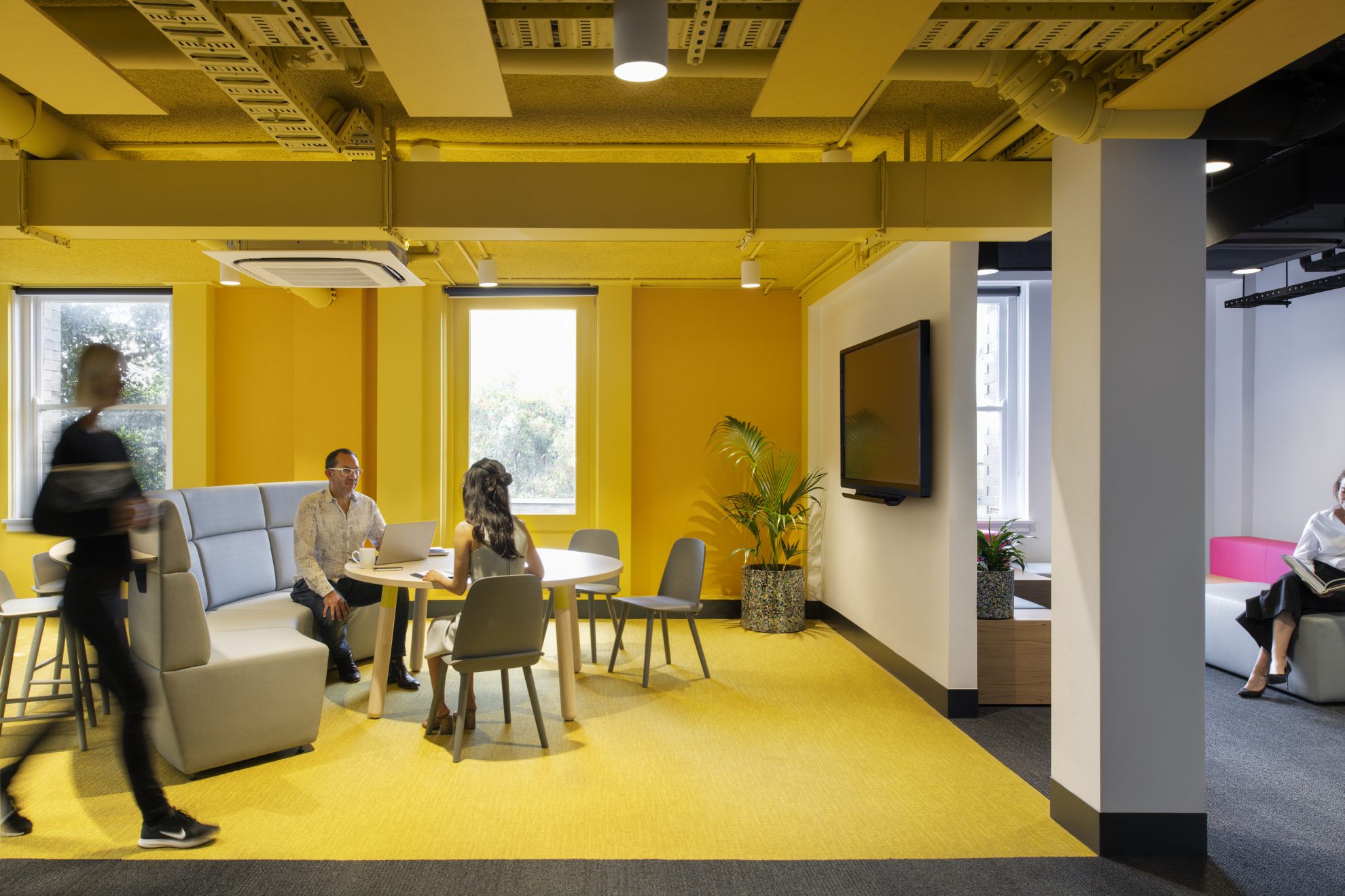
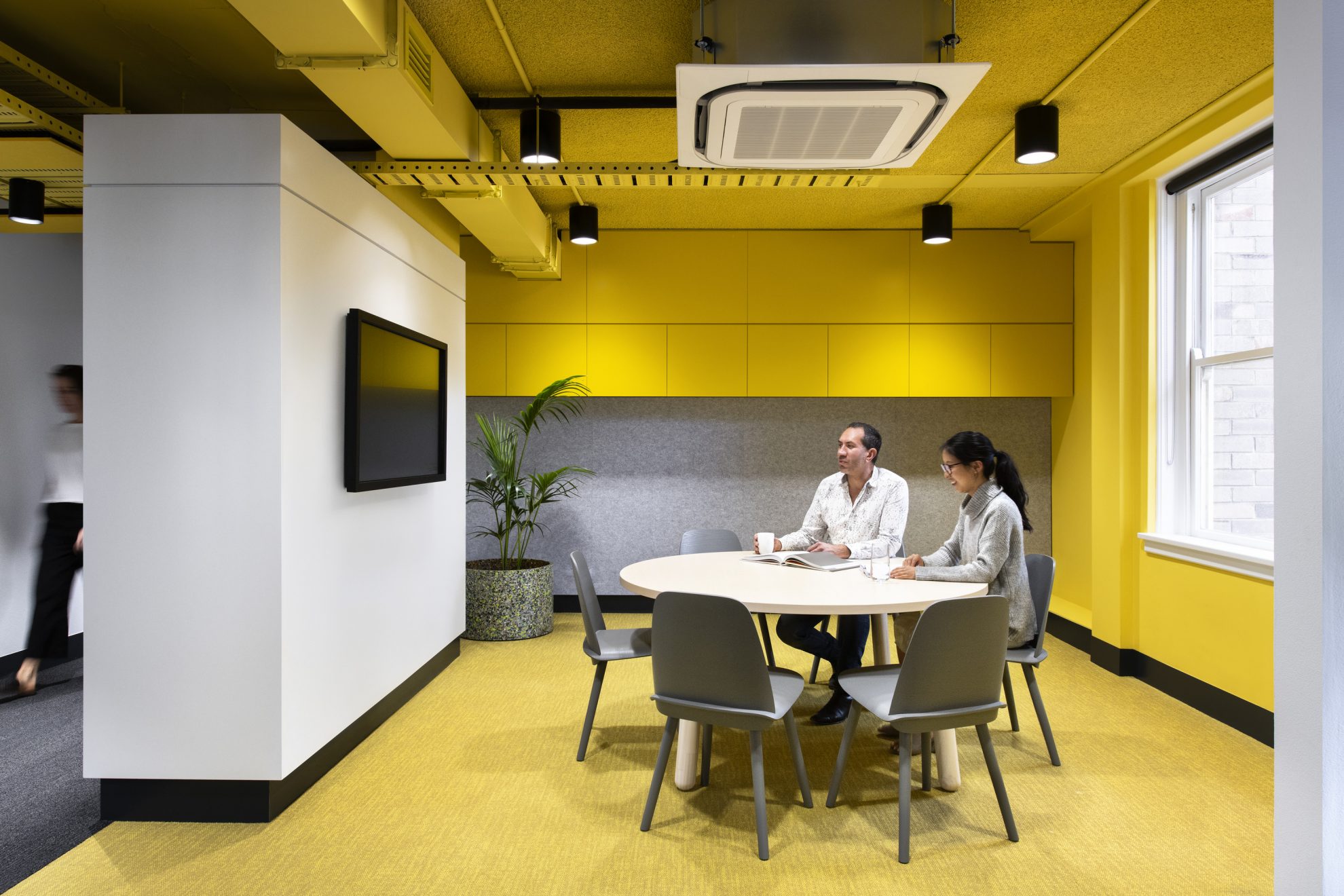
General work zones were calmer in their colour application, other zones made highly vibrant. Yellow indicated collaborative zones, pink was nourishment zones, blue were enclosed meeting areas, and green was additional teaching spaces. Zoning colours generally traversed along the floor finish, up the external wall and across the ceiling and services creating an “enclosed” space defined by colour, but not necessarily bound by walls. In addition, the 4 open stairs in each corner of the building were also given different colour treatment.
The result was a multi-use space, with easily identifiable functional zones which acted as a catalyst for improving the experience of those working or collaborating in the fit-out.
This project was recently shortlisted in the 2020 Dulux Awards in the Commercial Interior – Workplace and Retail category.
