CASE STUDY: An Identity Beyond Built Form for Stromlo Forest Anglican College
When COX began working with the Anglican Diocese of Canberra and Goulburn on Stromlo Forest Anglican College, our appointment was as Master Planners and Architects for a new greenfield campus. As the project progressed, our work naturally extended beyond the built form, giving the College an identity outside of its buildings and into the wider community of students, parents, and staff.
It all started when First Nations artist, Adrian Brown, had been commissioned to create an original artwork for the school. Rich with story and symbolism, it brought together the wedge-tailed eagle, the cross, and the mountains and trees as references to Mount Stromlo. As the school began applying the artwork more broadly, the challenges of how to adapt the artwork to operate beyond its original intention became clear. To be flexibly scaled and applied across uniforms, signage, digital platforms and print would require a shift in strategy.
Because COX had been working closely with the College and helping to shape their vision from the beginning, we understood their needs well – their underlying values, core principles, and design aspirations.
COX Graphic Design Manager, Daniel Da Cruz
We weren’t there to change the story. The meaning was already embedded in the artwork, and so our task was to refine it so it could perform technically. A logo must work just as confidently embroidered at 40 millimetres as it does across a building façade. And there’s a real thought process to that.
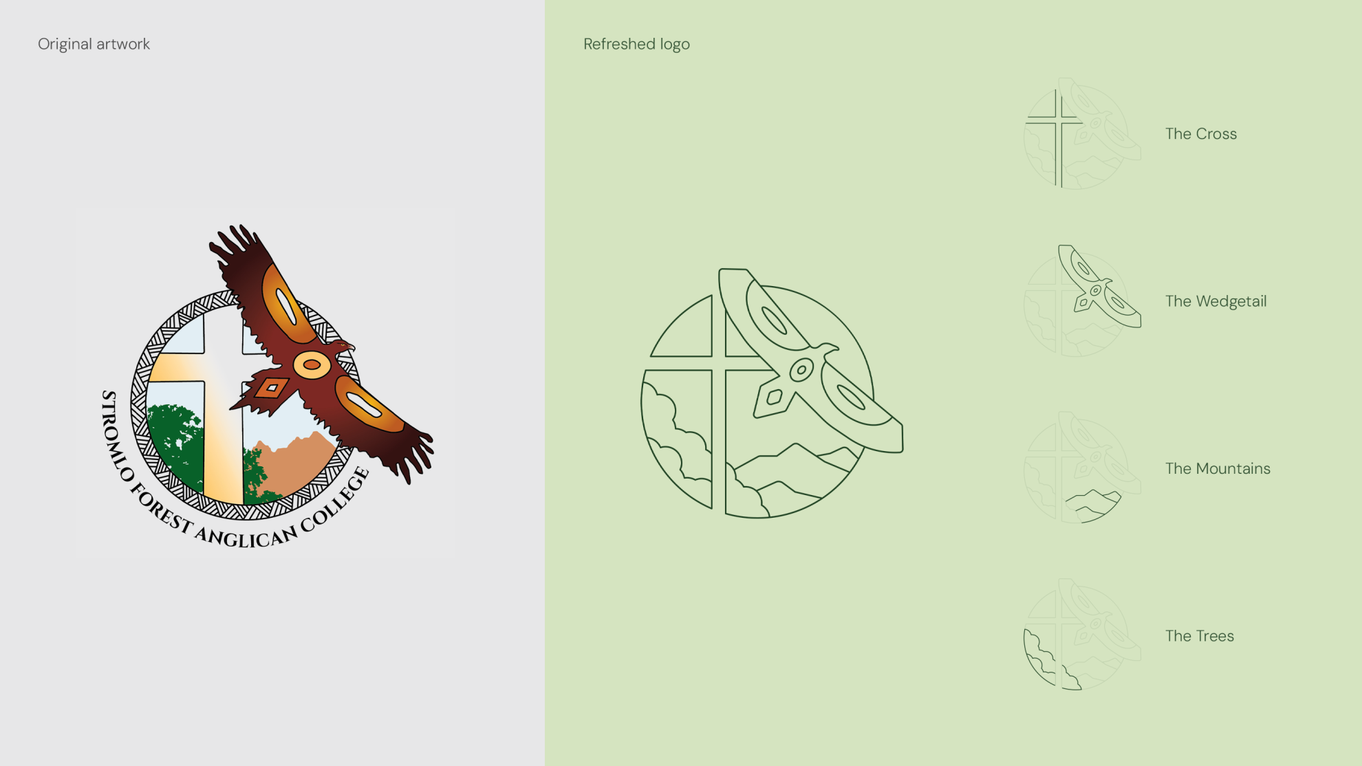
[Above: Left showing original artwork by First Nations artist Adrian Brown and right showing new logo and logo components by COX]
Respect shaped the process. The circular format remained and core elements such as the eagle, cross, mountains and trees were retained. The work focused on clarity and scalability: simplifying gradients into flat colour, refining illustrative detail into confident linework, providing logo variations to maintain brand strength and consistency across diverse scales and outputs, and ensuring the mark could hold together in single-colour applications without losing its recognisability.
COX Graphic Designer, Aidan Baron
The process was not as simple as just clicking a button and converting the artwork into linework. It took time to refine and simplify it in a way that honoured and represented the original artwork and its embedded meaning. Retaining its integrity whilst ensuring it serves the College’s needs was a constant balance within every design choice.
The eagle in particular required careful adjustment to maintain its symbolic presence while reducing visual complexity. The crest was also considered in tiers, from a detailed primary mark through to simplified and single-colour applications, allowing it to remain robust whether viewed on a building façade or stitched onto a blazer pocket.
Typography was refined to improve legibility and flexibility, maintaining an appropriate sense of tradition while ensuring practical long-term use.
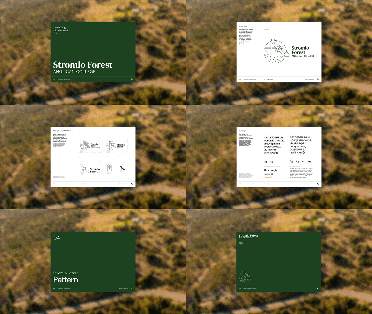
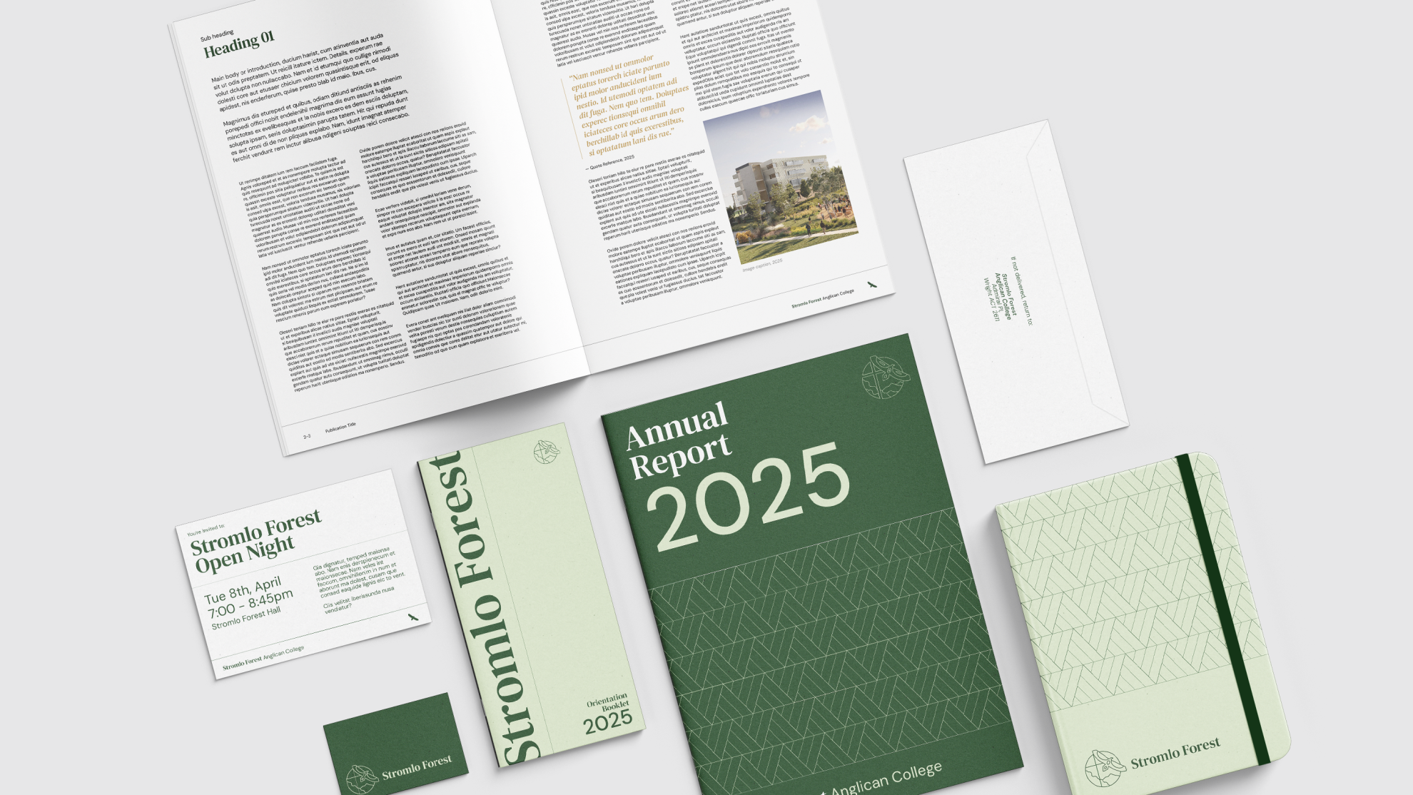
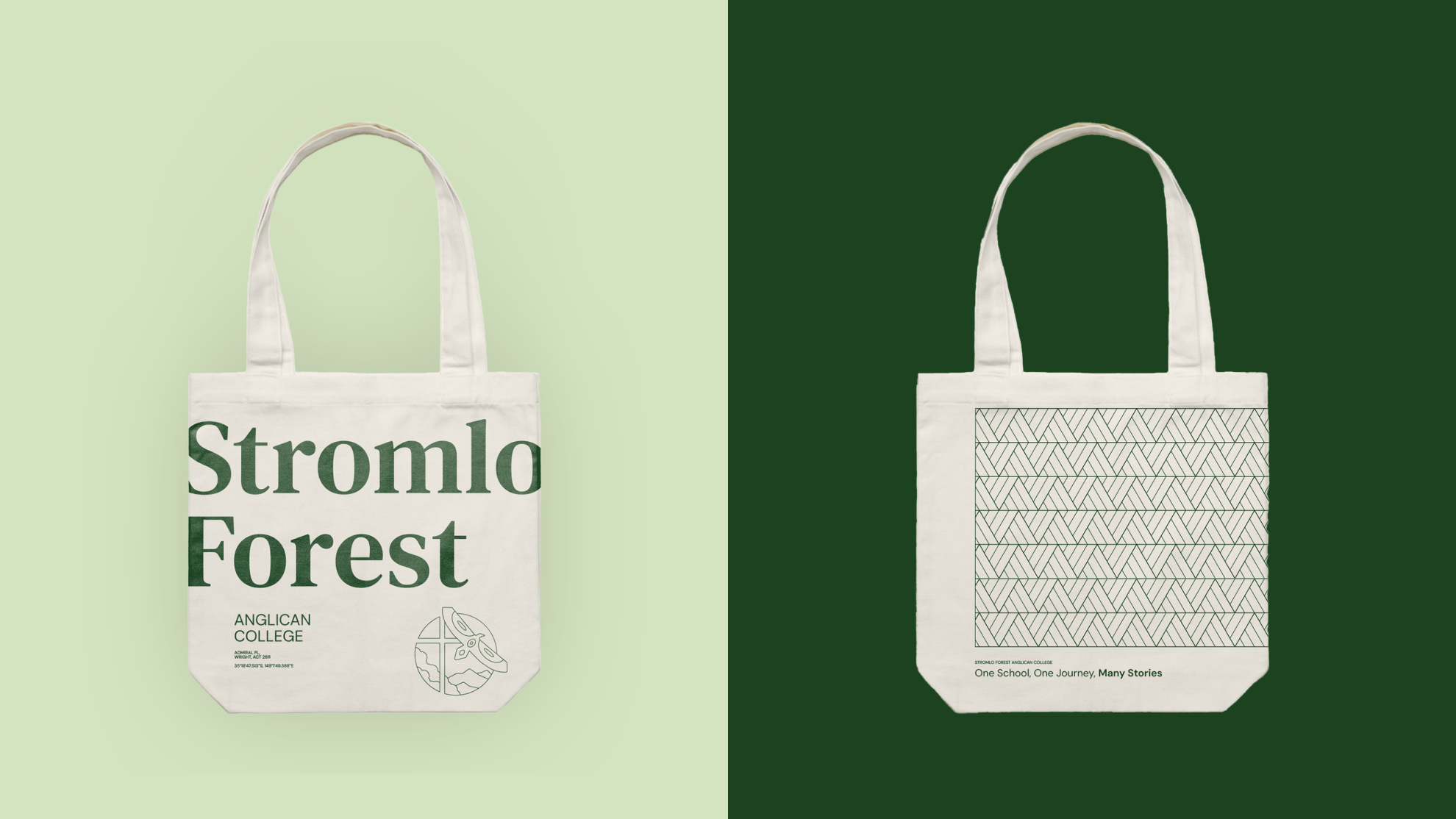
[Above: Brand guidelines and mock ups to visualise applications]
Because the identity was being developed alongside the architecture and future wayfinding, it was informed by how it would sit on buildings, integrate with signage systems and support staged campus growth. It was never conceived simply as a graphic overlay, but as part of a coordinated and holistic design approach. Everything needed to feel cohesive – one story, one place, and one identity.
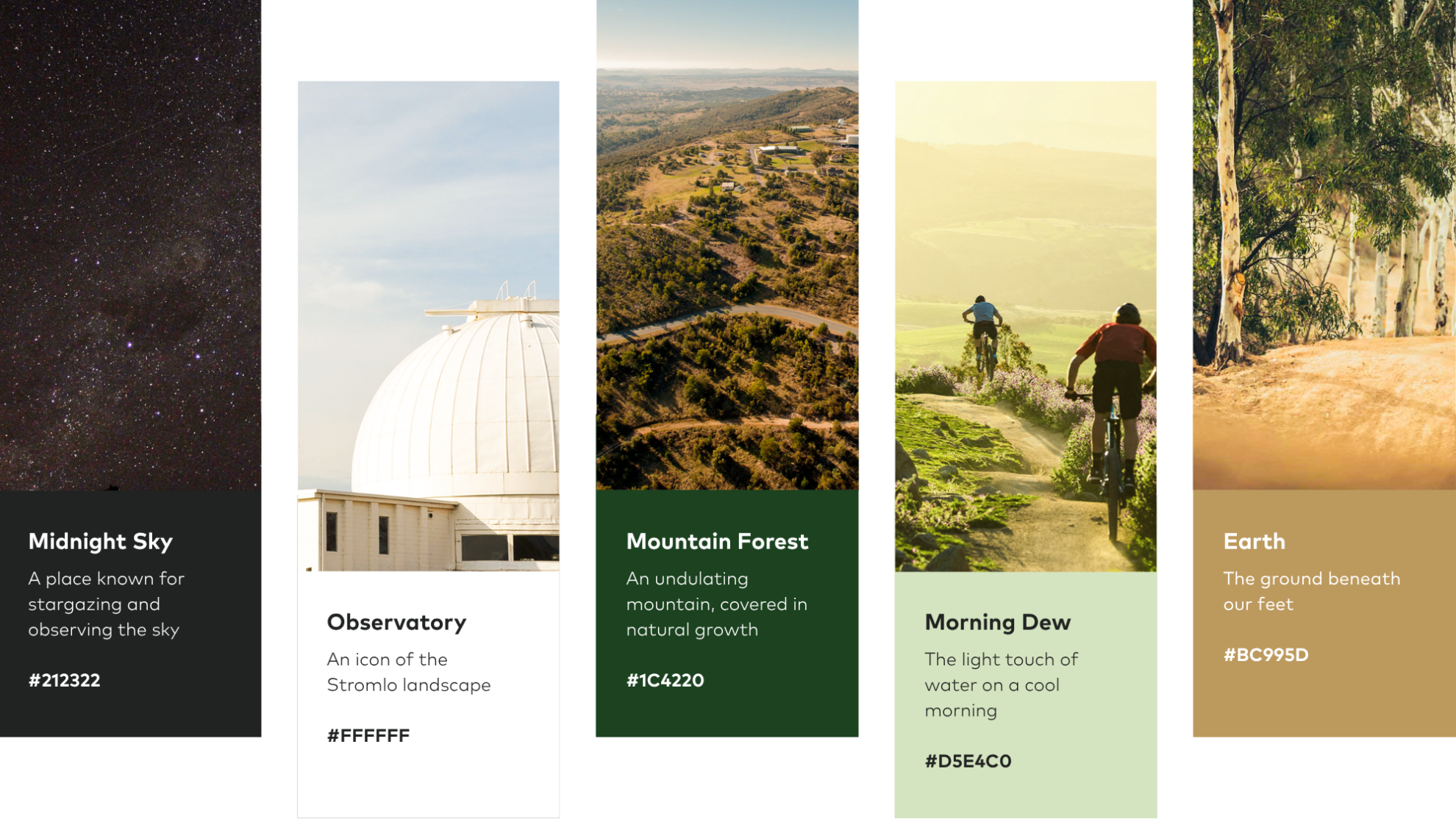
From there, the broader visual language followed. The colours were inspired by the Stromlo surroundings, both natural and constructed, grounding the brand in its place and context.
COX Associate Director, Gerard O’Connell
There’s a real advantage in having one team across architecture, branding and wayfinding. We understood the client’s vision because we’d been shaping the campus from the beginning. That shared foundation meant the identity could evolve in a way that felt completely aligned and authentic to what the College wanted to be.
As the campus continues to grow through the completion of each stage, the original artwork will continue to hold significance within the school, while the refined logo and holistic branding strategy provide a durable and adaptable identity for everyday use. Together, they establish a foundation that can evolve with the College while remaining grounded in its original story and intent.