Beyond the Logo: COX Rebrand a Finalist at 2019 AGDA Awards Across Four Categories
We’re very pleased to have been recognised by the Australian Graphic Design Association (‘AGDA’) for our recent work in rebranding the practice. We’re gratified to be finalists in four categories, short-listed against some truly exceptional projects for progressive organisations across a wide-range of industries.
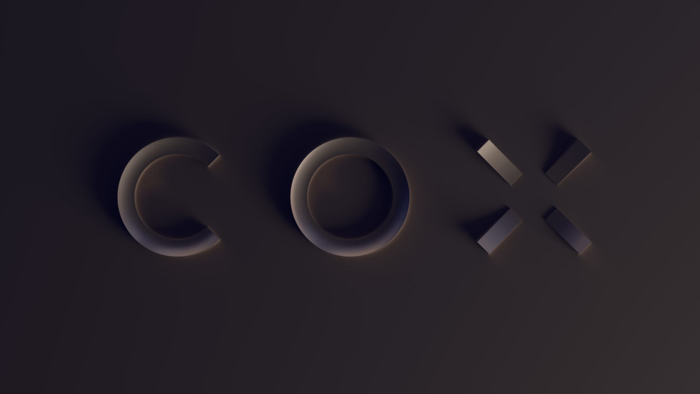
Sure, it’s a nice logo, right?
But it’s still only three letters. A bit more space, a touch more balance and an outcome that’s more legible and aesthetically pleasing. Ultimately, it’s a nice update.
Except it isn’t.
By which I don’t mean that it isn’t ‘nice’. What I mean is that the logo update is only the smallest and most incremental improvement resulting from a genuinely holistic ‘brand’ process. Without wanting to resort to too many clichés, the logo really is only the ‘tip of the iceberg’.
It’s important to recognise that this process has its origins in the internal recognition that COX was – and is – a practice in transition, and that this transition needed acknowledging, and reflecting on both macro and micro levels. It’s well documented that good branding should both reflect and lead change, so this project is seen as a catalyst for positive change… change that spans the whole gamut of organisational character; operations, ownership, technology, culture and purpose.
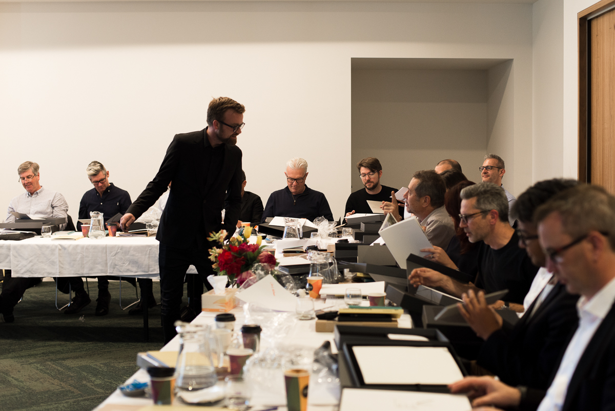
As such, in 2017 we spent a year in investigation – questioning and aligning, hypothesising and reflecting, categorising and prioritising.
As an Architectural practice with significant history, as a structure that’s both united and federated, and as a business with 43 vocal owners the challenges are many. But in the right context and with the right intent, these challenges can also be reframed as sources of unique insights and fuel for future distinctiveness.
And so it proved. Despite the many apparent binary tensions, the process did not resort to the safety of compromise. But neither did it resort to the traditional top-down, command-and-control method of imposing an approach. Rather than ignoring the differences across our studios, we recognised that these differences in many cases, arose from our connectedness to our contexts, and our deep roots in our respective cities. These differences are hard-earned and result in better services and more context-responsive design for our clients. And while it might seem counter-intuitive, it is this valuing of unique context that provides a powerful basis for an aligned culture and cohesive brand.
Building on this basis we recognised that the pace of change internally and the requirements of a ever-more complex world externally, had meant we’d moved beyond a principal-originated solutions approach, to something that is entirely more collaborative and meritocratic; we employ more staff, specialists, research and collaborators than ever before to derive the most holistic and impactful outcomes. And that we do this for an ever-expanding spectrum of sectors, typologies and project types than ever before.
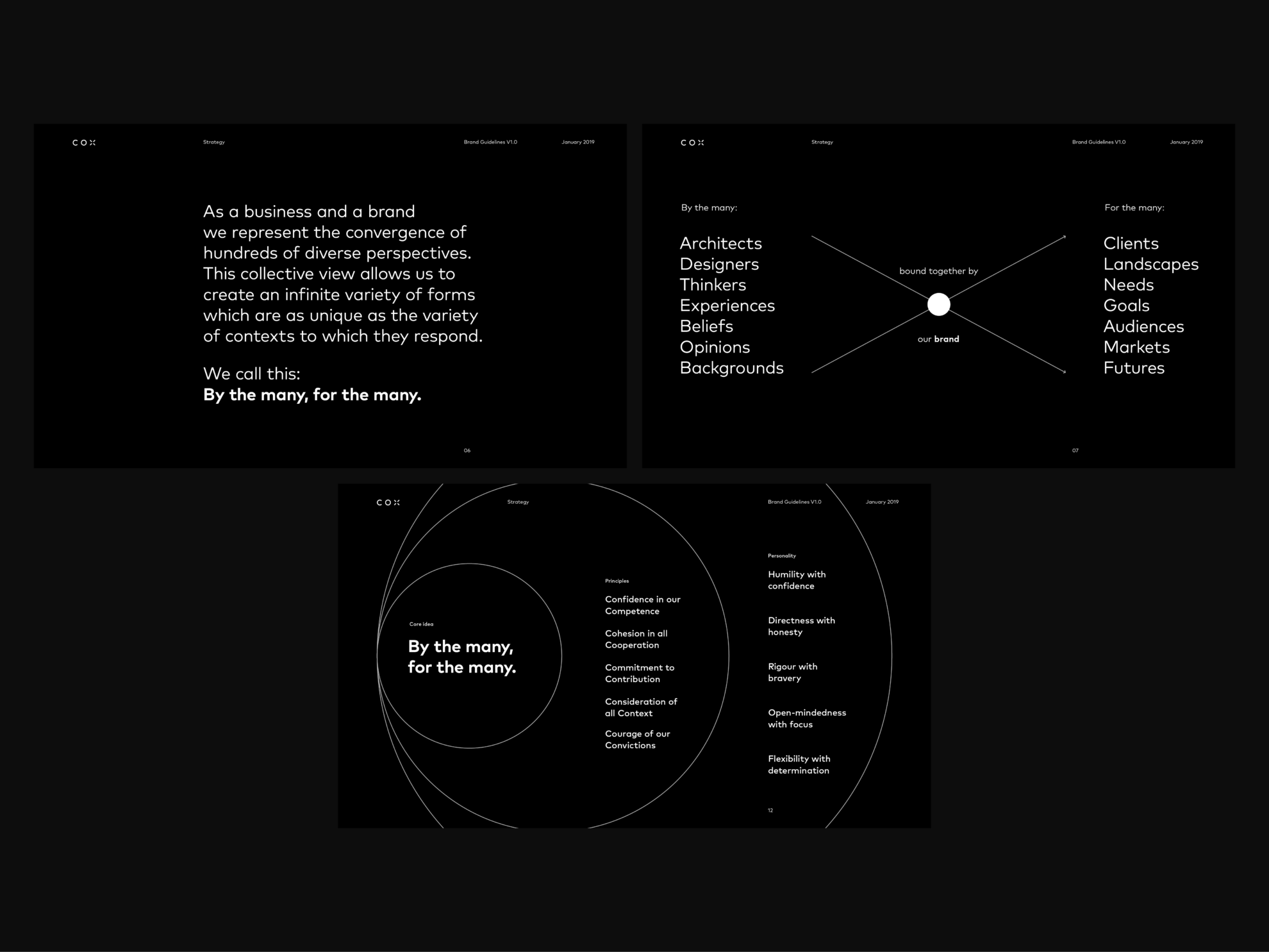
As a short-form, we’ve reduced these ideas and ideals to the statement ‘By the Many, For the Many’.
This statement is no slogan or tag-line… it’s a simple and powerful reminder of our commitment to design superior Architecture, public Architecture, that regardless of its type, helps provide new apparatus for not only a more functional, but a more civil society. Rather than being trite this is fundamental to who we are.
As a short-form, we’ve reduced these ideas and ideals to the statement ‘By the Many, For the Many’.
And it is this multiplicity of perspective and outcomes as well as our responsiveness to context that we needed to reflect in our branding in order to be authentic – and therefore successful.
As is the case with many insights and brand strategies, the difference between good and great is in the creative translation of insights to expression, from words to pictures. Added to this is the complication that for an Architectural firm, the true star and ultimately ‘the brand’ in real terms, is the ‘work’ and not the branding that sits above it. In short, we needed to complement rather than compete.
If our challenge wasn’t daunting enough, we would also need to grapple with the age-old but rarely resolved challenge of moderating a discipline that is emphatically defined in 3 dimensions, into a 2-dimensional expression.
So, where did we start?
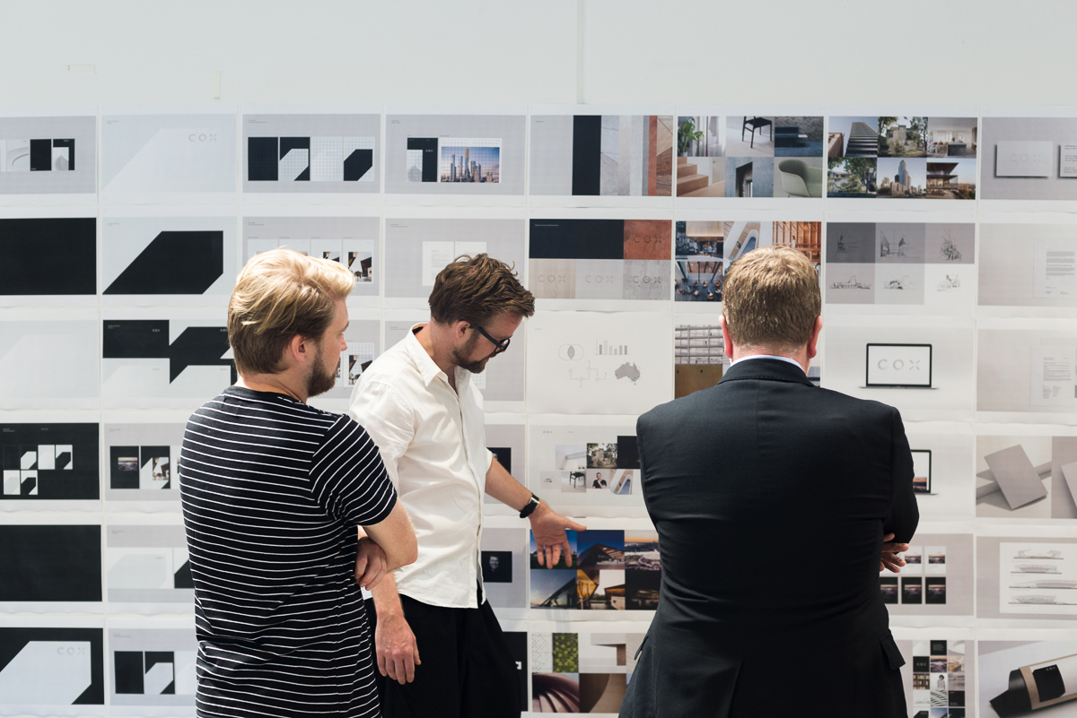
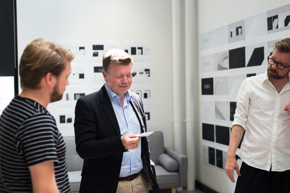
To be candid, we had two aborted attempts before we had our eureka moment. Many creative processes do not survive not passing a big creative hurdle first time. And it is testament to the strength of the strategy, the quality of relationships between us and our agency, VAN O, and our desire to move forward together that we persevered. These first two attempts yielded valuable lessons and insight and they failed, not because of the quality if the design, but in that they didn’t convey our three strategic insights with equal efficacy. It was a tough brief and we’re a tough audience.
Luke van O
A successful outcome from projects of this scale depends almost entirely upon the strength of the relationship between client and agency. Fortunately my team has been supported – and challenged – at every turn by a client who understood the nature of the work and kept it held to the highest possible standard throughout: never giving up on its ambition, never settling for compromise, never seeking to dilute the idea or cut off its corners in pursuit of an easier life.
At times this has been exhausting, but the creation of meaningful work is, and should be. It’s easy to make a mirror: far harder to make a lens that brings everything into focus.
We kept coming back to the same expression, ‘perspective’.
It’s a word that has precise visual and geometric meaning but it is one that also has powerful intellectual and emotional resonance. We needed to imbue our solution with more perspective, in its fullest sense. And we quickly realised that the false geometry and drop-shadows of many logos wouldn’t cut it for a pre-eminent Architect. More than this, what we really value are perspectives; it is the diversity and multiplicity of inputs and outputs that makes us, us. And this meant that a flat, singular and static solution was out of the question.
So, logically we needed something with real form, expression and movement.
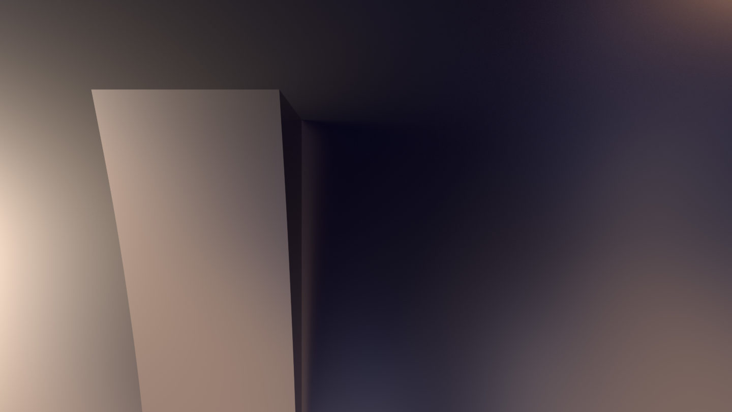
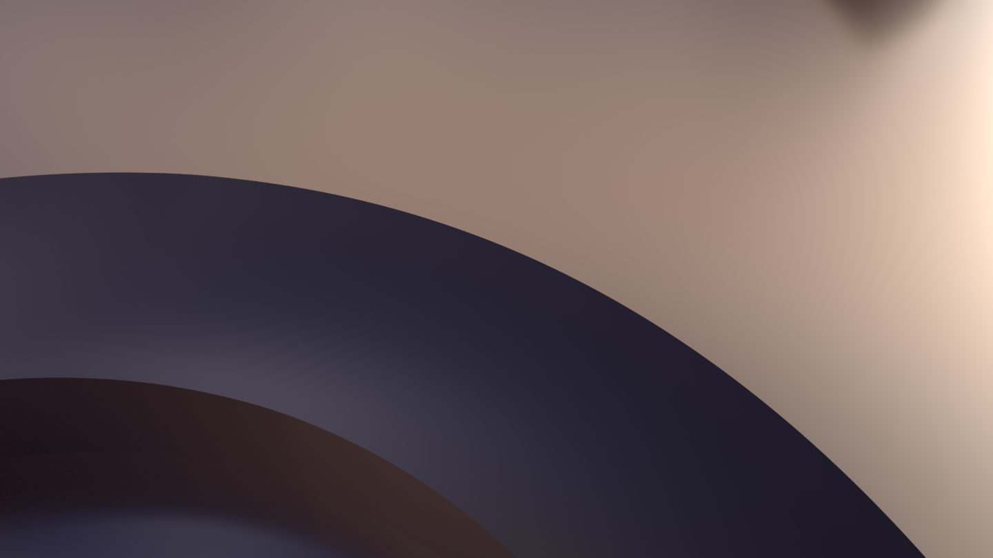
Our thinking around perspectives and form, the inputs and the outputs of our work, led us to interrogate the visual relationship between these two factors. We quickly realised that what allows us to perceive form, was the presence (or absence) of light and shadow, and the dynamic relationship between them.
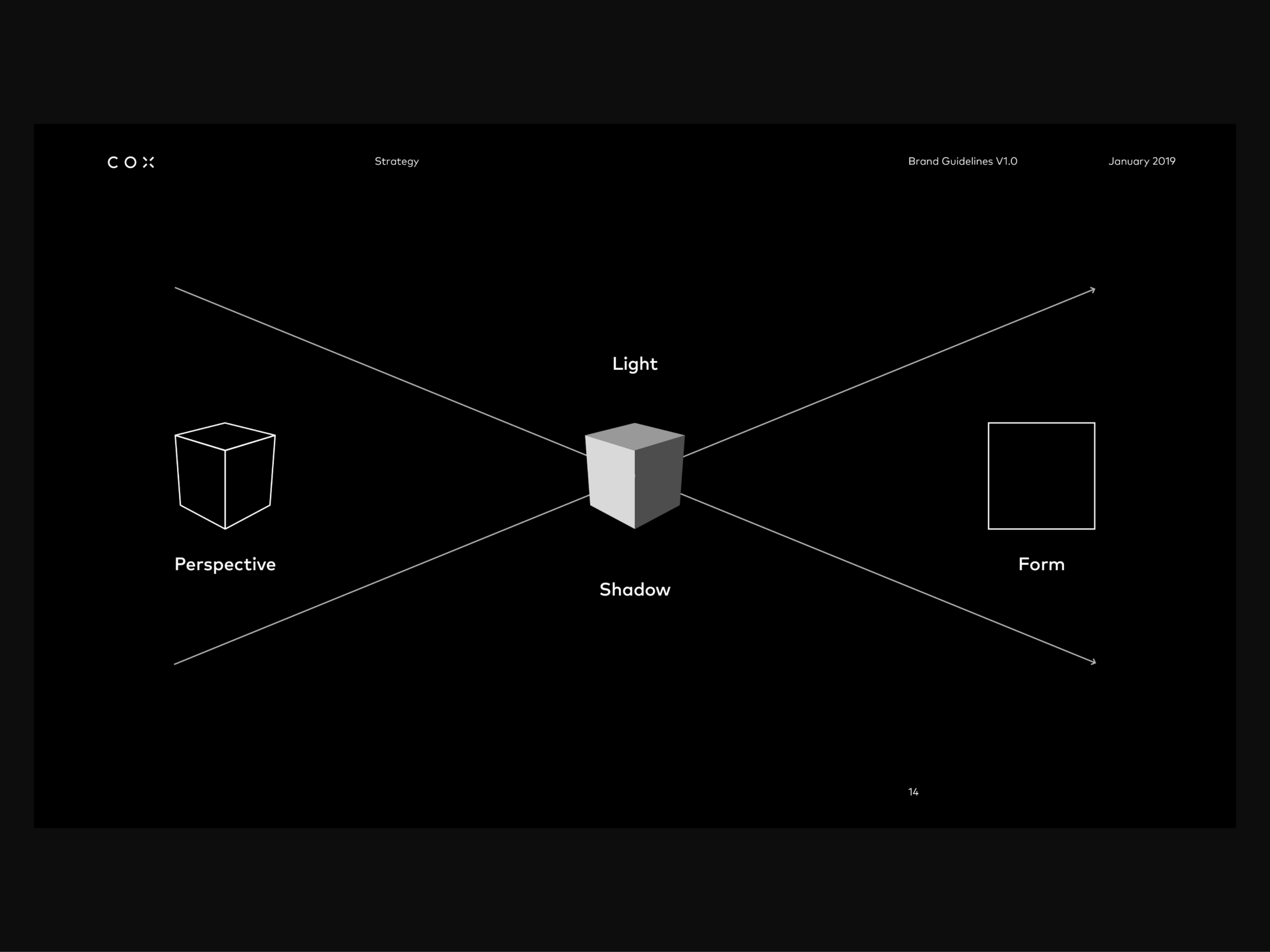
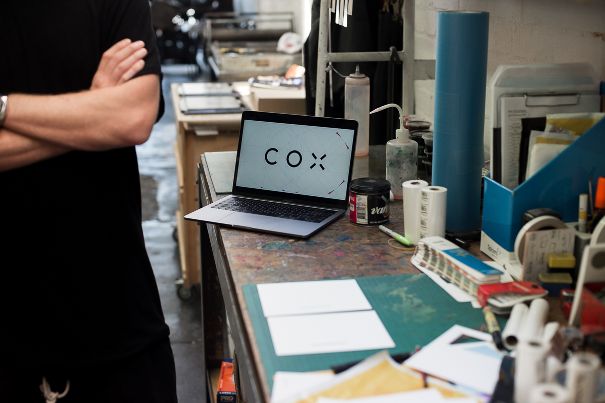
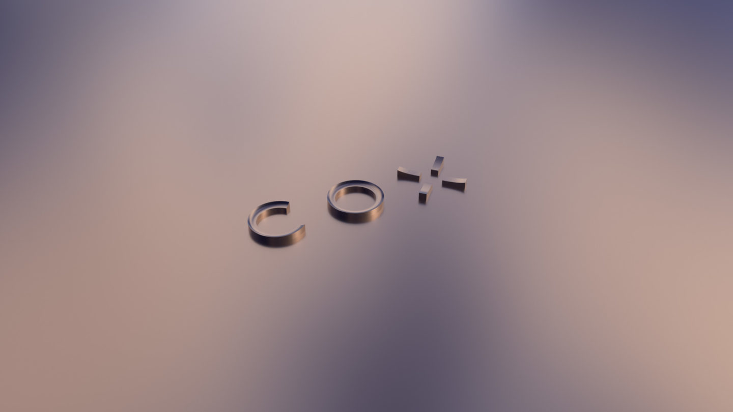
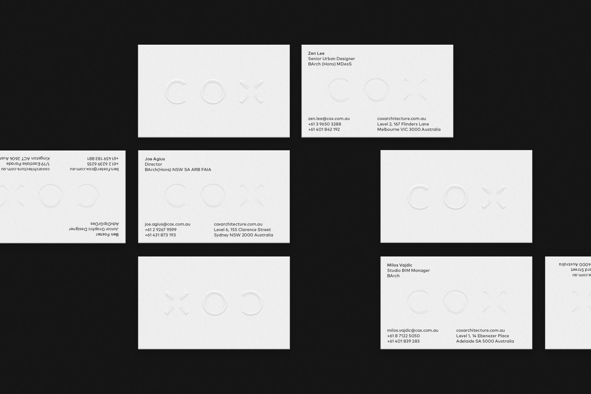
We started with a much more precise, mathematically robust footprint for the wordmark, with only minor tweaks added for optical purity for a base mark. It was then we were faced with the challenge of extruding form from it… genuine volume, rather than imposed surfaces with superficial structure. So, we walked the talk of collaboration and involved one of our Director-Architects, Chris Millman, who extended our typographers’ craft into three dimensions, blending it with the Architectural fundaments of proportion and of the optimal relationships between x and y.
From this, even the static expressions of this ‘volumetric’ wordmark would be accurate and pure, based on the real maths of real form and sources of light. Such purity and authenticity might seem graphically gratuitous for others, but it’s a non-negotiable for those who sacrifice their professional lives at the altar of form.
In an ever-more digital media landscape, we were also able to effectively dramatise our pure, but simple letterforms through movement, light and materiality. The outcome is as dramatic as it is subtle.
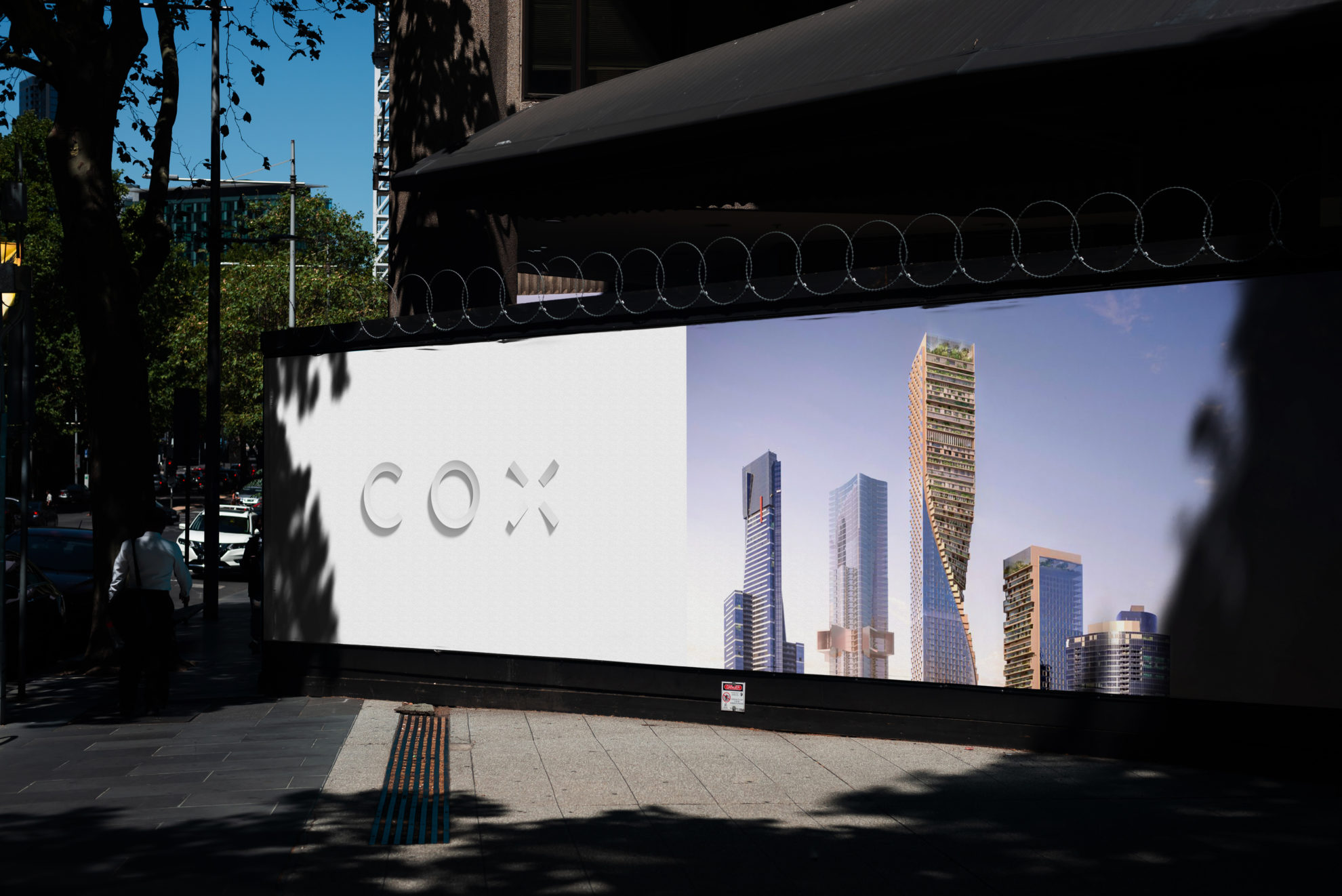
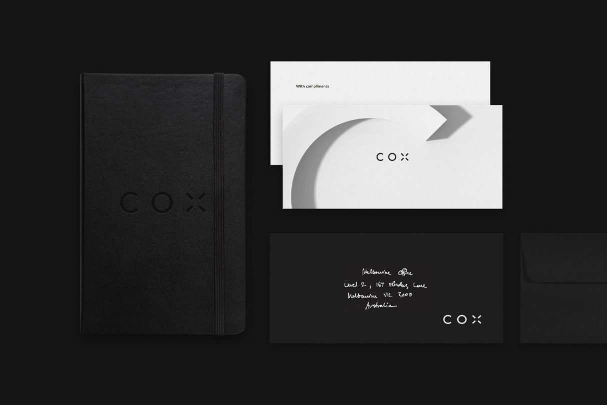
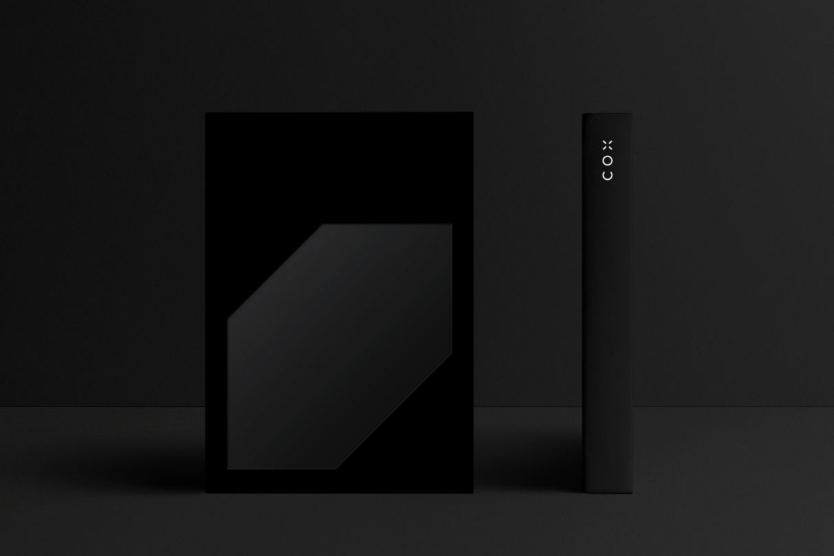
The point about materiality is an important one. Our base palette is monochrome and without traditional ‘highlight’ colours, and rather than this being dull or recessive it allows the colour to come from our work; buildings and interiors, details and structures, sketches and renders. We’re swimming in them, so why not let them sing? This does not mean the brand system has no colour. As a direct translation of the strategy our brandmark has the ability to respond to context, reflecting our approach to Architecture and design. By this we mean the brandmark can take on the surface materiality prevalent for a specific building or interior – it could be rendered as concrete, marble, stone, bronze or rough wrought iron – thus reflecting the contextually bespoke approach of the practice.
As a direct translation of the strategy our brandmark has the ability to respond to context, reflecting our approach to Architecture and design.
This all sounds complicated doesn’t it?
Well, it is and it isn’t. It is, because compared to a simple, static system it’s harder work. And it isn’t because the process of its creation recognised that COX staffs some of the most capable designers, compositors, renderers and animators you could wish to meet. We knew early on that the system needed to embrace these talents and challenge them.
Luke van O
What you ‘see’ emerging from this two and a half year process has the hands of nearly 500 practitioners on it, yet manages to avoid being the result of design-by-committee. It’s simply a product of context; a reflection on the unique characteristics of the practice and its place within the world. It’s a tribute to the discipline itself and the legacy of COX’s founders, placed in context of a body of work that’s as varied, ambitious and constantly-evolving as the people who produce it.
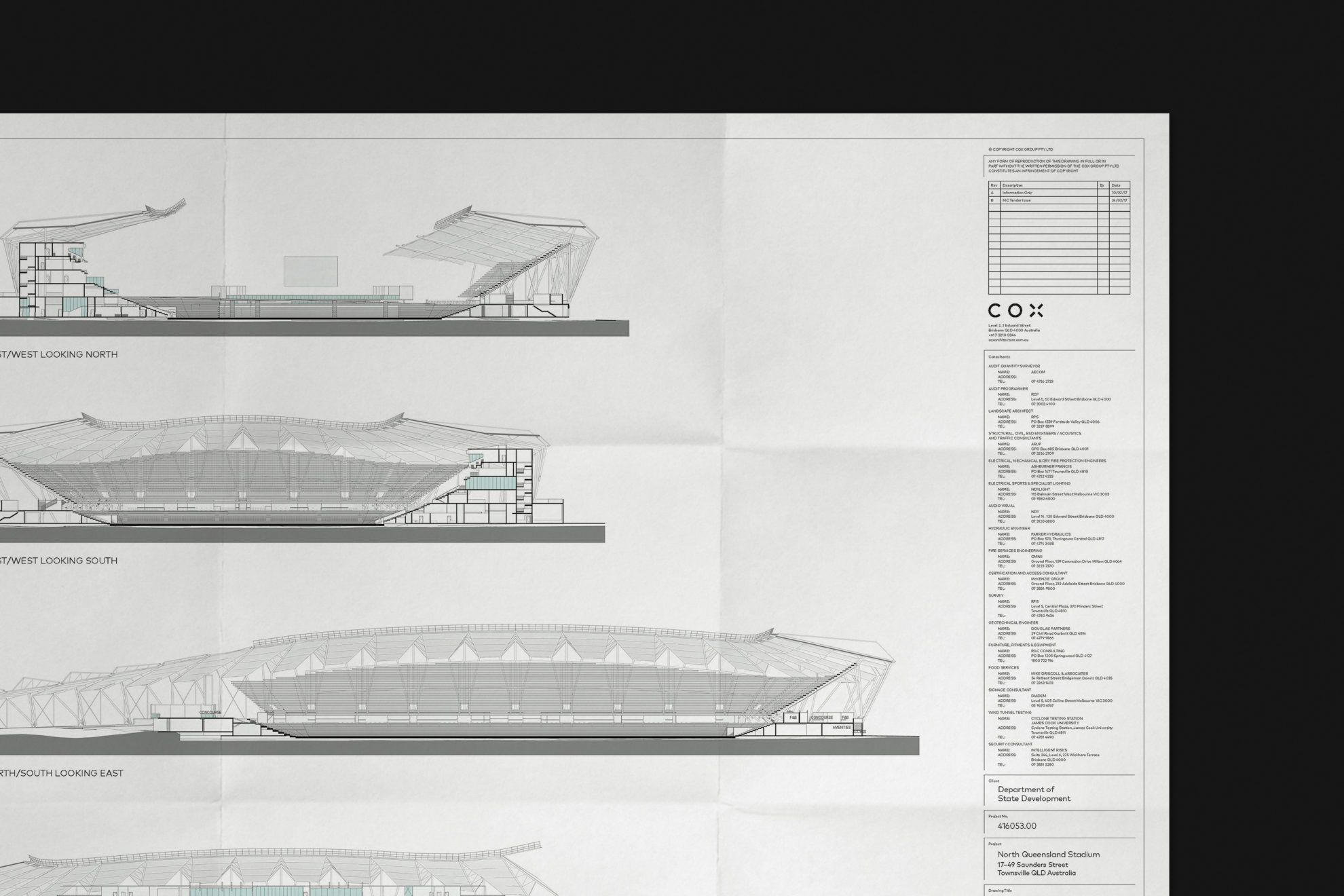
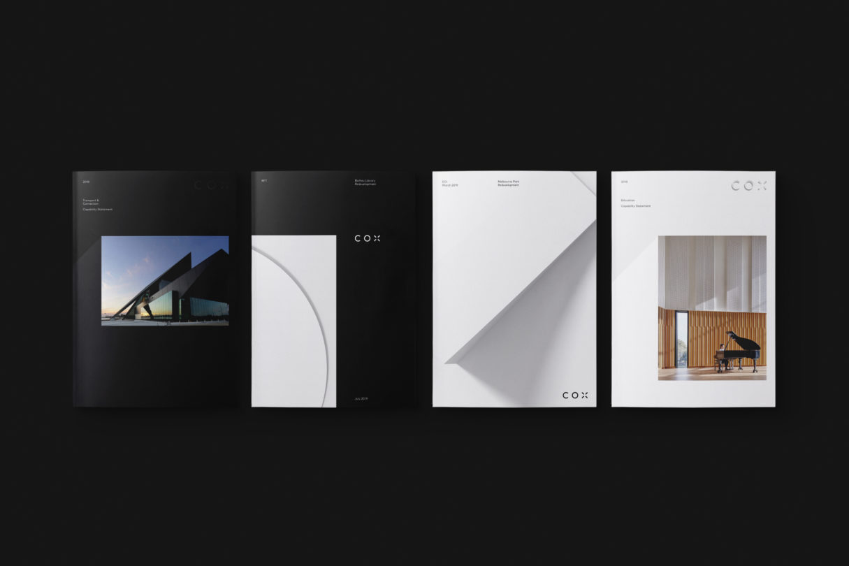
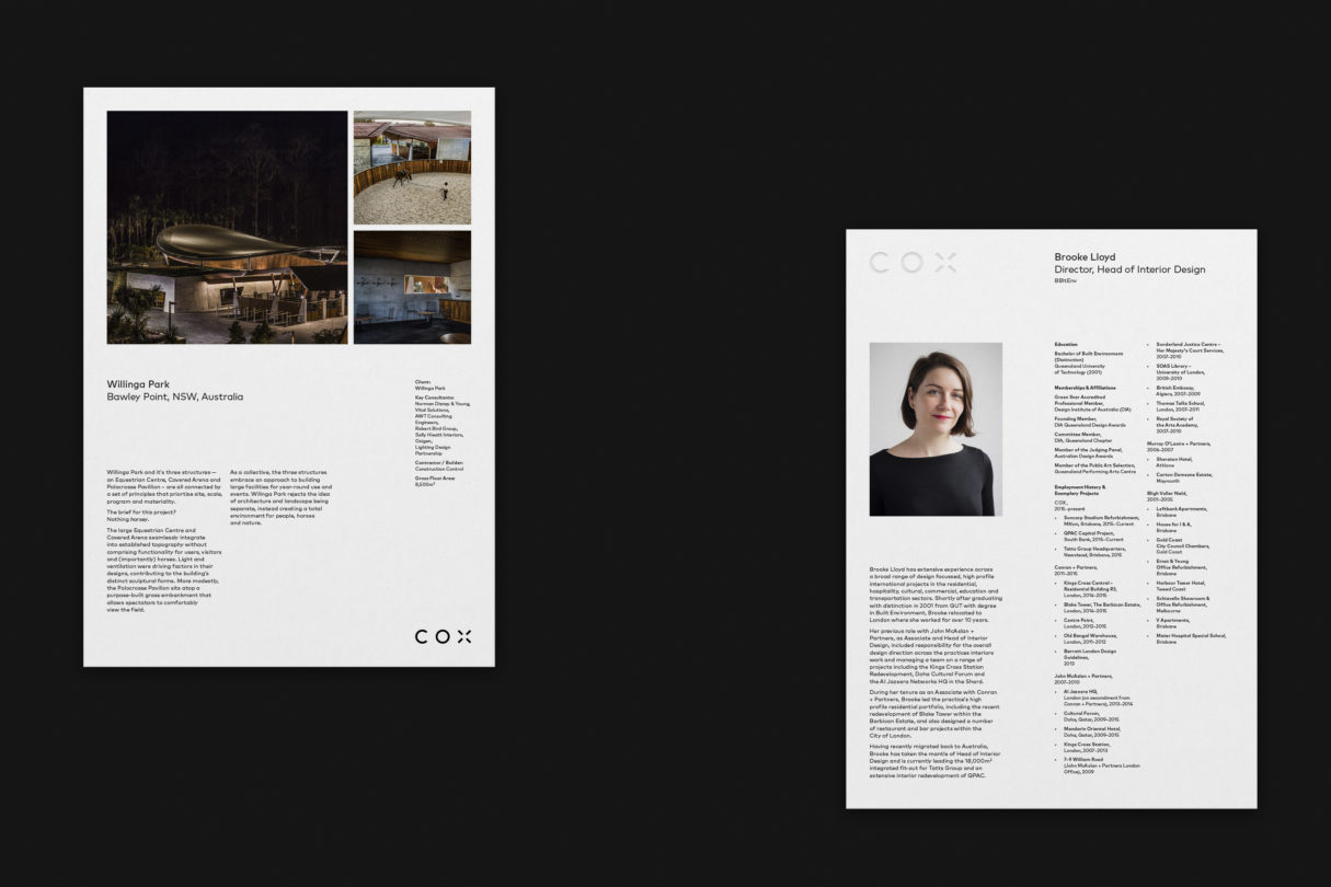
But the geometry, maths and sophistication of the system goes beyond the logo. COX and VAN O have worked closely to produce a ‘brand grid’ that underpins our numerous associated templates, that share the same DNA as the brandmark, and which balance the practical needs of day-to-day practice with the desire for diversity-within-unity of expression.
So, back to iceberg metaphors, and yes, it’s a nice logo.
Words: Cliff Nichols
Credits:
Agency:
VAN O, Melbourne – Luke van O, Marco Due, Carlo Mussett, Katie Byrnes, Conlan Normington (Motion Graphics and 3D), Thomas Tkatchenko (Technology & Development)
COX Internal Design Team:
Nathan Antico (Sydney), Pippa Hurst (Perth), Benjamin Ngooi (Melbourne), Travers Murr, Ervin Fontana (both Brisbane)